Brand Identity: Visual Language & Design System
Creative Director
Brand Strategist
UI Designer
3 Months
Figma
Adobe Suite
Standing Out in a Crowded Market
The healthy food and recipe market is already crowded with brands using similar visual codes and messaging. The challenge was to create a short, memorable name that immediately connected with food, then build a distinctive identity around it that could stand out in the market and scale consistently across a digital product and future marketing touchpoints.
A Playful and Approachable Brand System
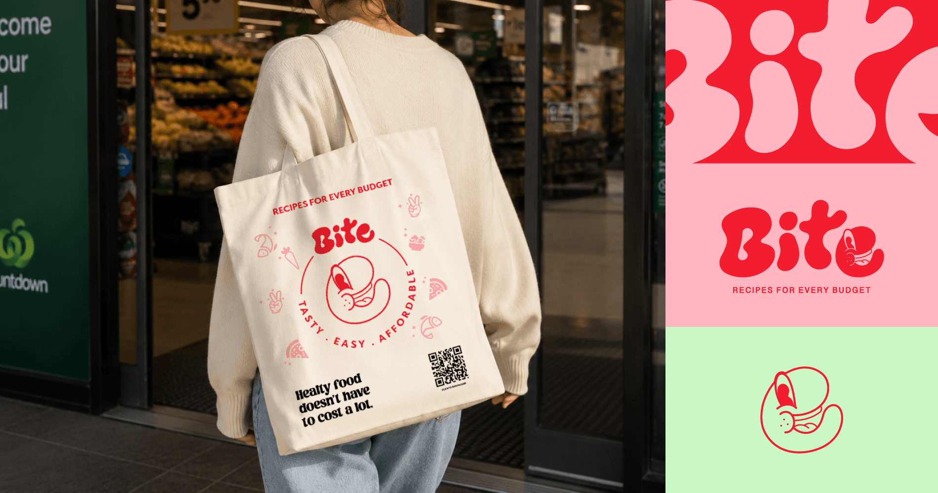
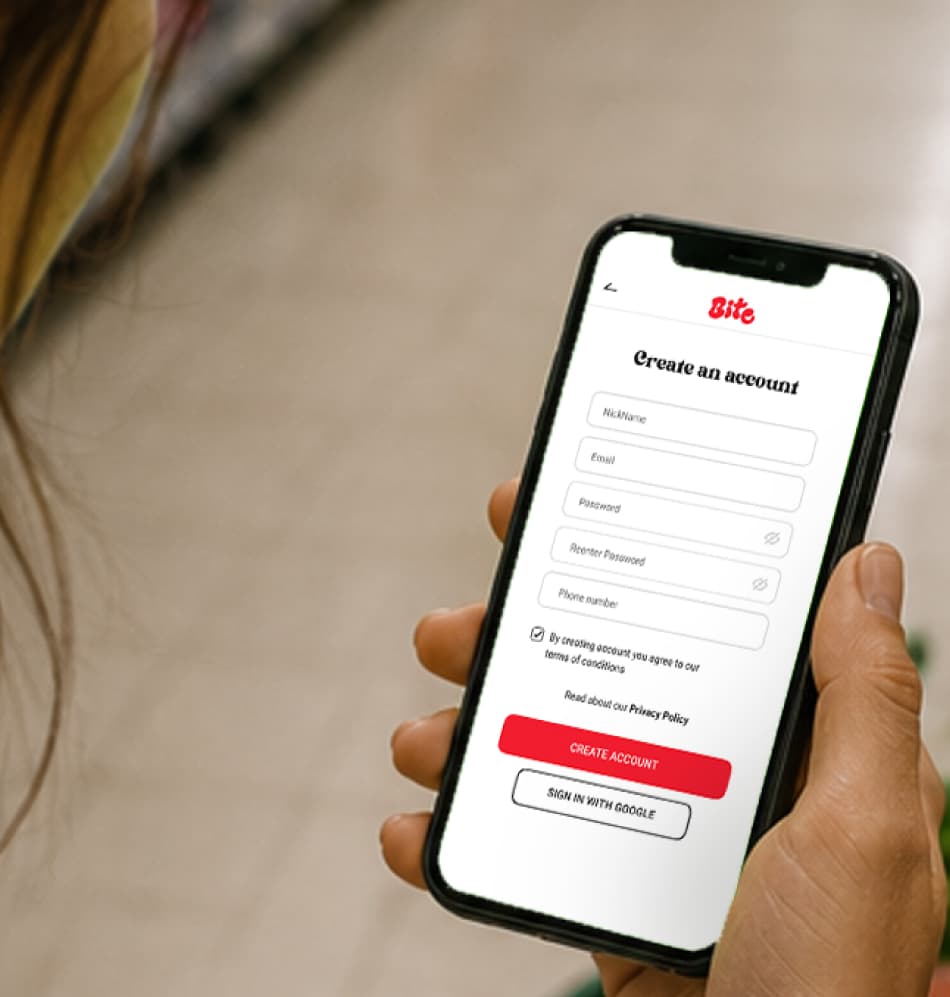
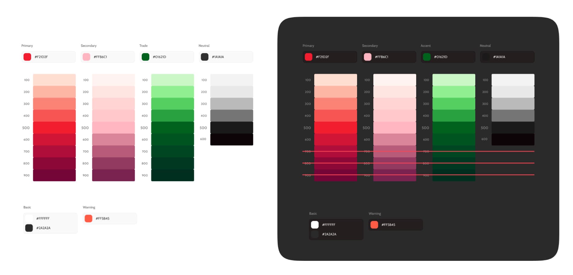
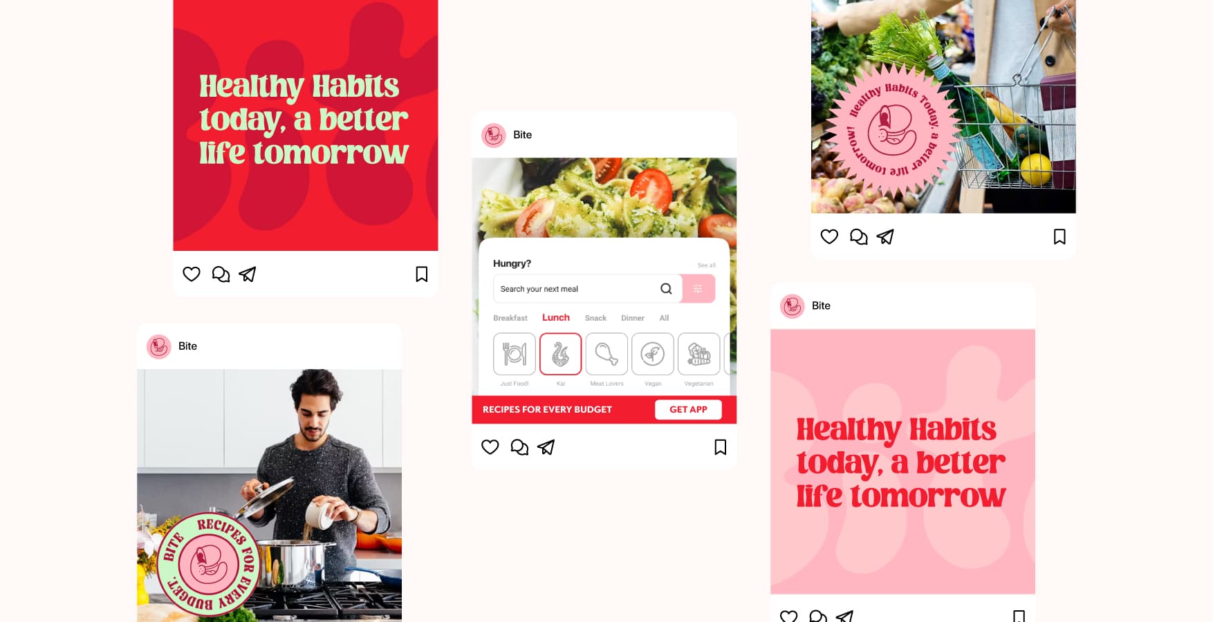
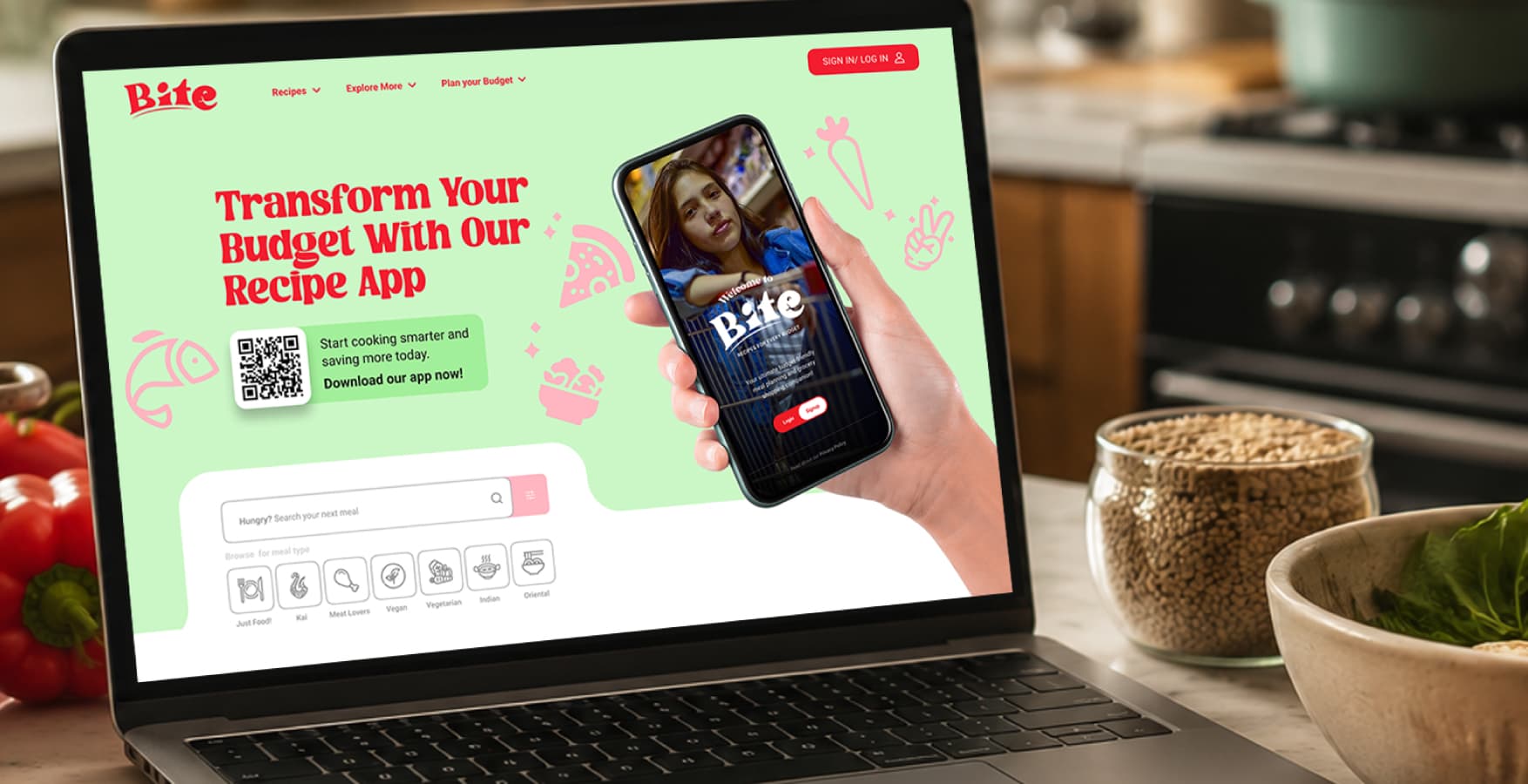
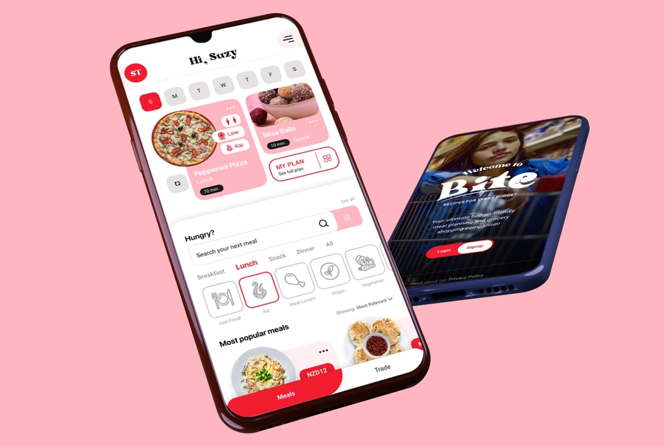
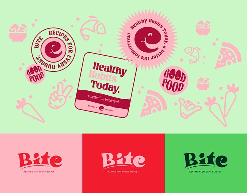
Bite became the foundation of a playful and approachable brand built around making healthy eating feel accessible rather than restrictive. A bold red and pink palette, expressive typography and a character embedded within the logo established a distinctive visual identity. These elements were then translated into a basic design system, creating the foundations for consistent icons, UI components and marketing assets as the product evolved.
Friendly, Playful & Encouraging
Bite's voice is friendly, playful and encouraging. It avoids the restrictive or overly serious language often associated with healthy eating, focusing instead on making meal planning and cooking feel simple, accessible and enjoyable.
The tone is direct and conversational, using clear language, short messages and moments of personality to guide users without overwhelming them. Across the product and marketing touchpoints, the voice reinforces Bite as a helpful companion rather than an authority telling people how they should eat.
Standing Out from the Convention
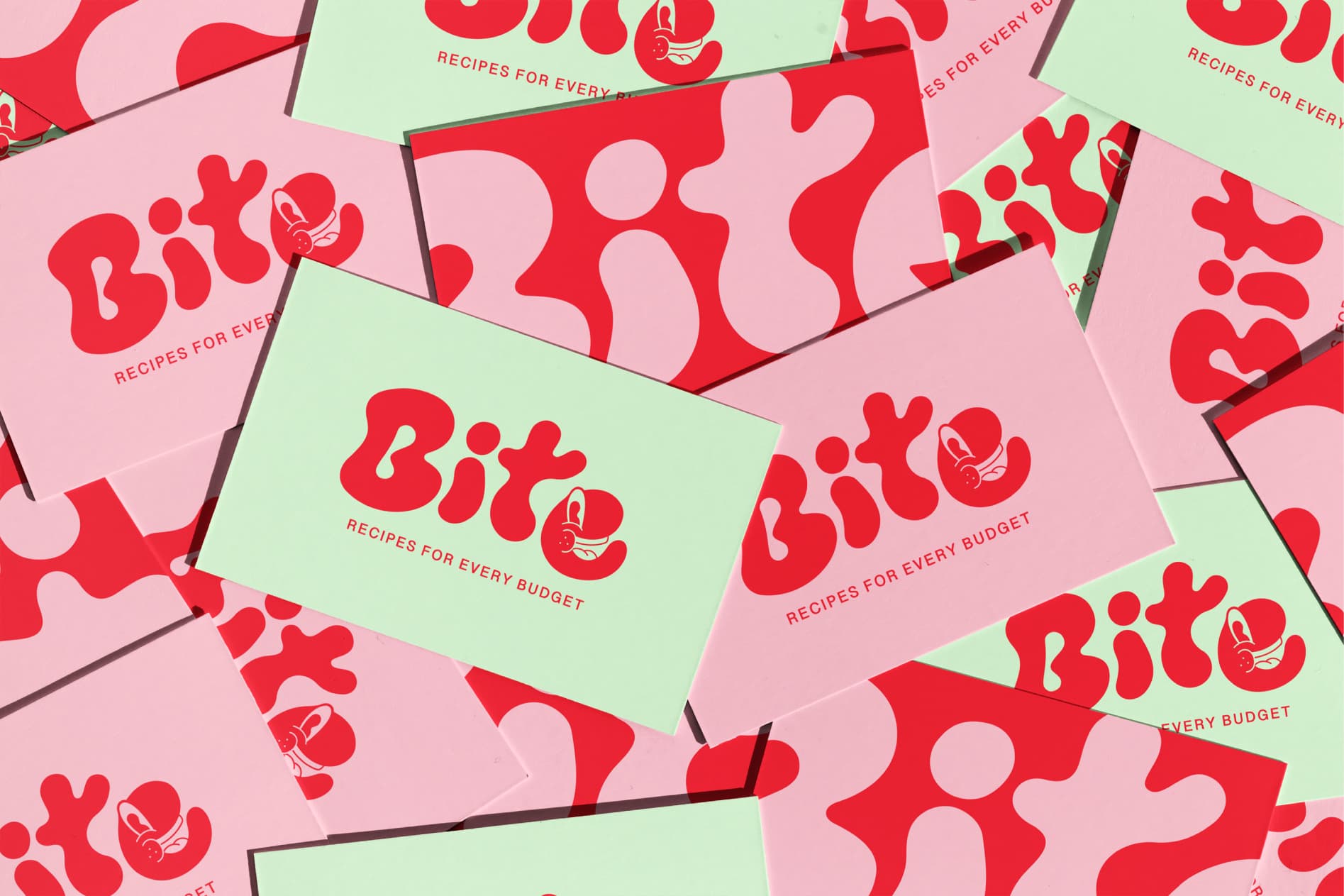
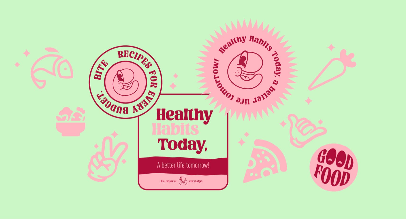
Bite's visual identity was designed to stand out from the conventional visual language of health and nutrition brands. Bold reds, soft pinks, expressive typography and playful shapes create a distinctive system that feels energetic, approachable and recognisable.
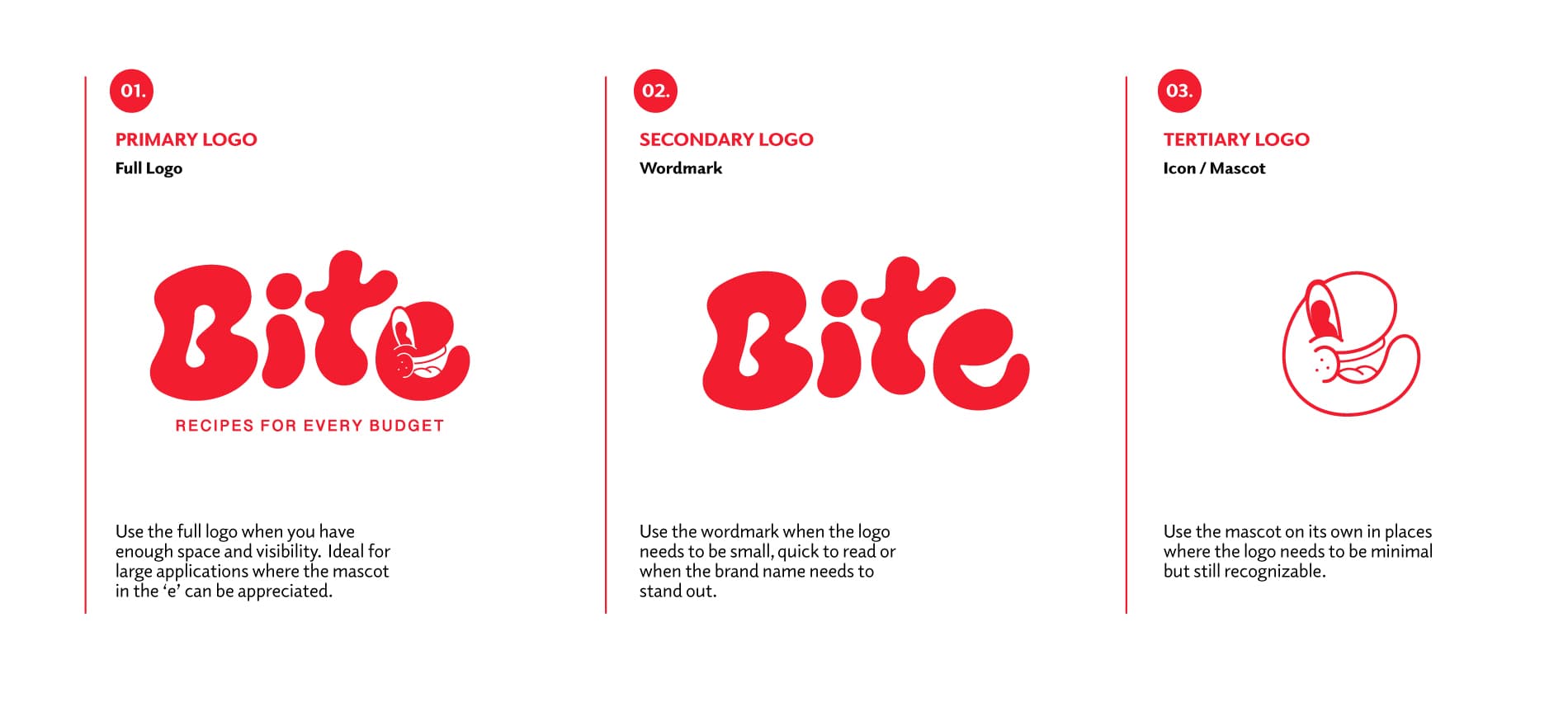
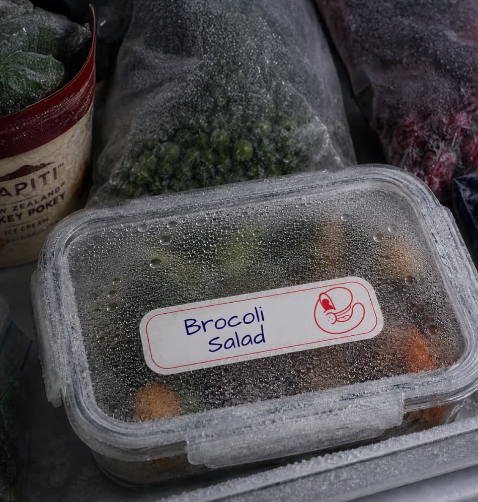
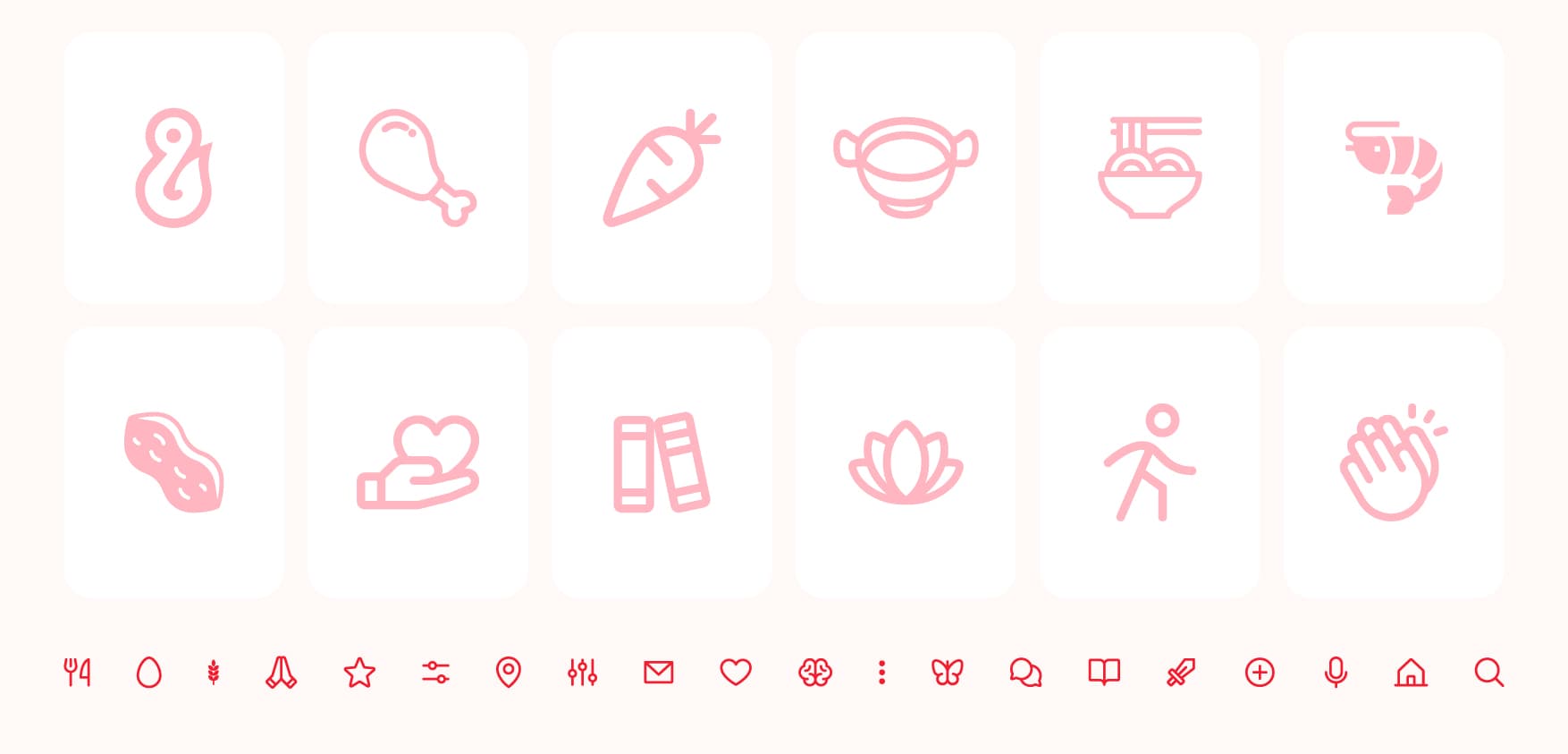
The logo established the foundation for a broader visual language that expanded into colour, typography, iconography, illustrations and graphic assets. These elements formed a flexible design system capable of maintaining consistency across the product, website and marketing materials.
Complete Design & Branding Guidelines
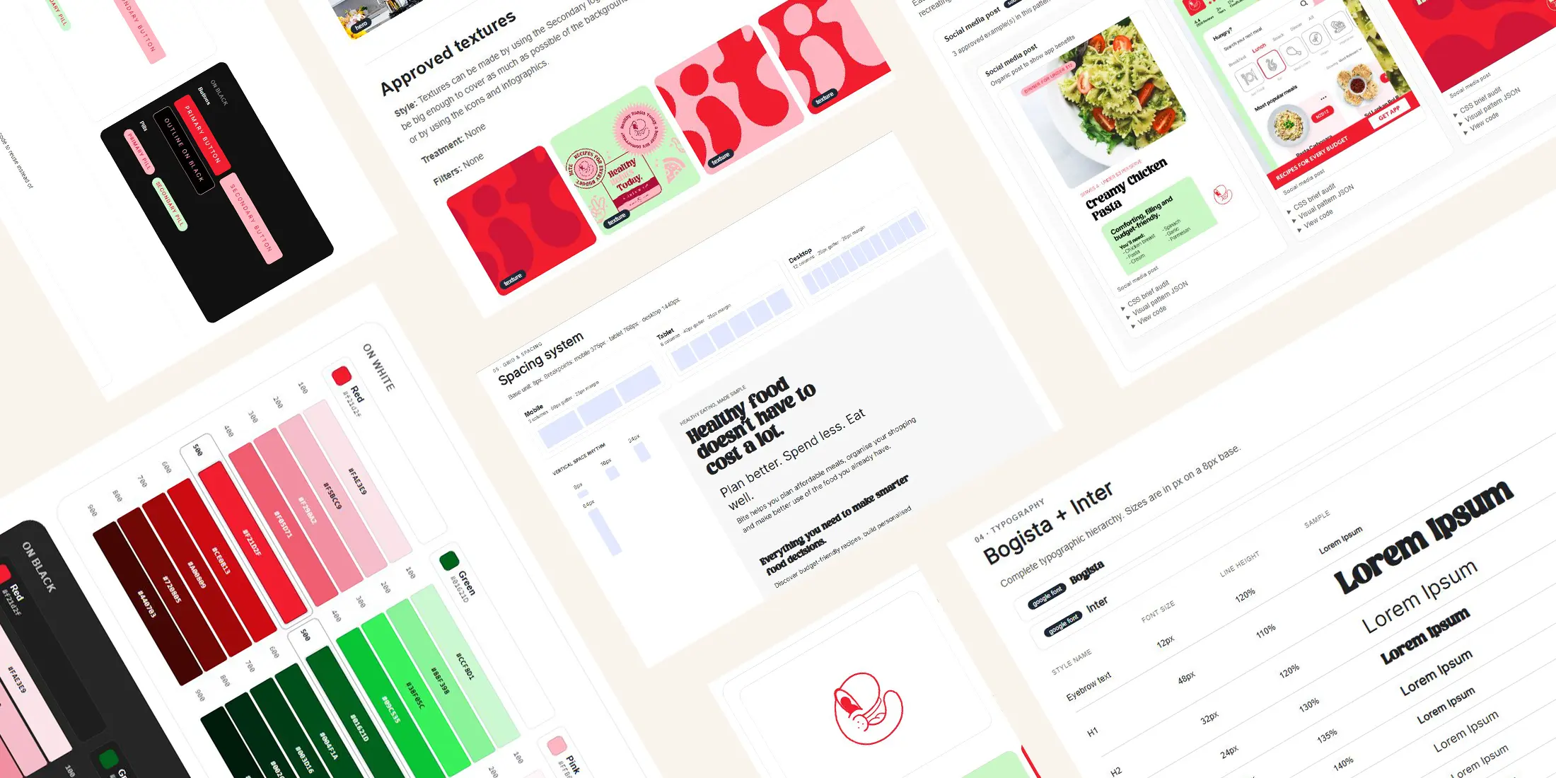
The full Bite branding system establishes a robust visual foundation. It defines logo usage rules and color-allowed backgrounds, specifies a semantic and core color system, details typography pairings and scaling, defines layout principles, and includes a comprehensive component design system (buttons, inputs, and forms) along with high-fidelity imagery and icon guidelines.
Other Case Studies
Interested in
working together?
Whether it’s a new product, a website, a brand or a complex business challenge, I’d love to hear about it.